 Available at
  Tweet
Tweet
So here's the pull back of Jude's black and white I took yesterday. It's a fairly dark room, and the window gets indirect (soft) light. I let one side of the curtains down to decrease the size of the light source. The larger the light source the more light "wraps around" your subject. The smaller the light source the more dramatic the lighting, and more shadows. I placed Jude about 18 inches from the window, covering the electrical outlet on the wall. I stood him against the wall, 90 degrees to the light source. 90 degrees creates the dramatic split lighting effect with hard shadow line down the center of the subject's nose and forehead. The light should not spill over to the other cheek. Jude's forehead looks a little dark in this, probably because his head is tilted down. If I had angled him 45 degrees towards the light source the light should wrap over his nose and create a triangle of light (Rembrandt's triangle) under his far eye. 45 degree is the universally most flattering light, but getting a little kid to sit or stand at the right angle is hard, if not impossible. It's beautiful when you nail it, but I have a lot of practice to do on that.
 pull back by Erica Beyer, on Flickr
Here's my SOOC. I think I did a pretty good job getting the lighting effect I was going for. I used a B&W preset in LR that made the shadows super dark. I cloned out the little highlight on his right arm. In PS I reduced noise, added some blur to his face and body, increased sharpness in his fingers and blanket just a tad to highlight where the focus fell. I didn't intentionally focus on his fingers (he was moving a lot) but I like the way that turned out. His facial features look softer and more "dreamy," and the blanket becomes the an equal subject.
 lovey SOOC by Erica Beyer, on Flickr
And the final again
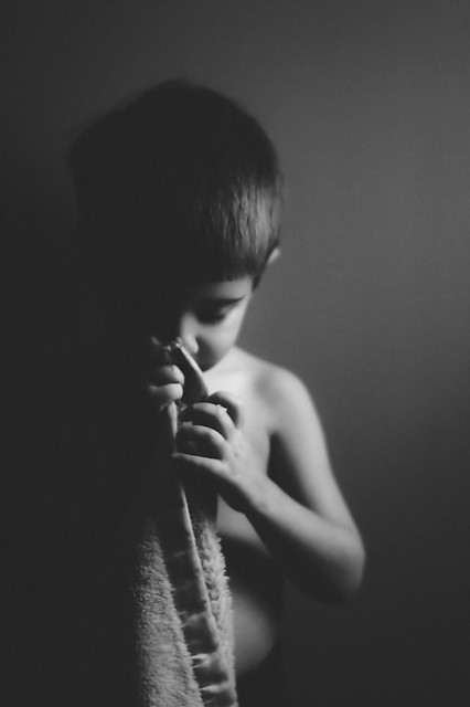 stinky lovey 2014 by Erica Beyer, on Flickr
HTH!
pull back by Erica Beyer, on FlickrHere's my SOOC. I think I did a pretty good job getting the lighting effect I was going for. I used a B&W preset in LR that made the shadows super dark. I cloned out the little highlight on his right arm. In PS I reduced noise, added some blur to his face and body, increased sharpness in his fingers and blanket just a tad to highlight where the focus fell. I didn't intentionally focus on his fingers (he was moving a lot) but I like the way that turned out. His facial features look softer and more "dreamy," and the blanket becomes the an equal subject.
lovey SOOC by Erica Beyer, on FlickrAnd the final again
stinky lovey 2014 by Erica Beyer, on FlickrHTH!
Comment